Unit 14
Magazines
|
|
Importance of Genre
A genre is a category or style of art, music, films etc. But why do we have genres? Genres categorises what type of style we like for example in the film industry we have countless amounts of genres such as 'Action' 'Romance' 'Comedy'. Genres make finding any movie, television show, music a lot more easier and accessible, than searching for the specific thing you are looking for.
A genre is a category or style of art, music, films etc. But why do we have genres? Genres categorises what type of style we like for example in the film industry we have countless amounts of genres such as 'Action' 'Romance' 'Comedy'. Genres make finding any movie, television show, music a lot more easier and accessible, than searching for the specific thing you are looking for.
Importance of Magazines
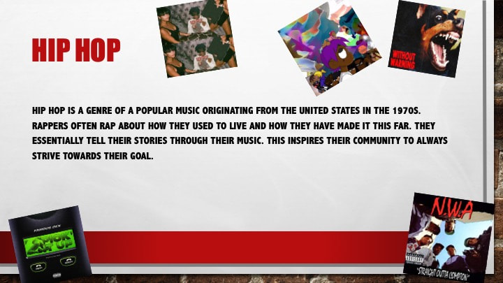
A magazine is a periodical publication containing articles and illustrations, often on a particular subject or aimed at a particular readership. In todays world many people do not like the new technology that has come into the world or they struggle to use the web, so we buy magazines. Magazines can be related to newspapers but are not the same. Newspapers have to cram all their news into 40 pages, which is not a lot regarding the amount of news that is issued. A magazine also has news but does not need to be crammed into 40 pages. The news is not brief like the newspapers. In magazines they go in full depth of information and it is all to do with the type of magazine category it falls under.
A magazine is a periodical publication containing articles and illustrations, often on a particular subject or aimed at a particular readership. In todays world many people do not like the new technology that has come into the world or they struggle to use the web, so we buy magazines. Magazines can be related to newspapers but are not the same. Newspapers have to cram all their news into 40 pages, which is not a lot regarding the amount of news that is issued. A magazine also has news but does not need to be crammed into 40 pages. The news is not brief like the newspapers. In magazines they go in full depth of information and it is all to do with the type of magazine category it falls under.
Print Magazines Vs Digital Magazines!
A print magazine is a printed publication that comes out regularly and includes photographs and articles. They publish periodically and includes illustrations or photos and usually advertisements. A digital magazine or online newspaper is delivered in electronic form which is formatted identically to the print version. Digital editors are often called a digital facsimiles to underline the likeness to the print version. Why would people choose the digital version of a magazine over a hard copy of it? It is because we find everything in the 21st Century easier when it is digital.
A print magazine is a printed publication that comes out regularly and includes photographs and articles. They publish periodically and includes illustrations or photos and usually advertisements. A digital magazine or online newspaper is delivered in electronic form which is formatted identically to the print version. Digital editors are often called a digital facsimiles to underline the likeness to the print version. Why would people choose the digital version of a magazine over a hard copy of it? It is because we find everything in the 21st Century easier when it is digital.
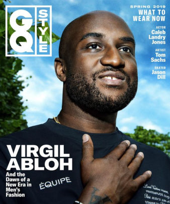
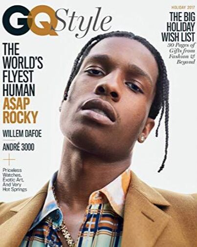
GQ Magazine(Style)
GQ was formally known as Gentlemen's Quarterly until it was changed back in 1967. GQ is mostly focuses on Fashion, Style and Culture for Men, although they still feature Food, Movies, Fitness, Sex, Music, Travel, Sports, Technology and Books. GQ is portrayed as a 'Men's Magazine' but they include the most up to date news about the country and additional information. The magazine also presents annual "GQ Men of the Year" awards to recognise the most influential Men in a variety of fields. For example in the category Style and Fashion Virgil Abloh was on the front cover of GQ Style for his great work in his Company/Fashion Label "OFF-WHITE". Another example is Ed Sheeran on the cover of GQ Music.
GQ was formally known as Gentlemen's Quarterly until it was changed back in 1967. GQ is mostly focuses on Fashion, Style and Culture for Men, although they still feature Food, Movies, Fitness, Sex, Music, Travel, Sports, Technology and Books. GQ is portrayed as a 'Men's Magazine' but they include the most up to date news about the country and additional information. The magazine also presents annual "GQ Men of the Year" awards to recognise the most influential Men in a variety of fields. For example in the category Style and Fashion Virgil Abloh was on the front cover of GQ Style for his great work in his Company/Fashion Label "OFF-WHITE". Another example is Ed Sheeran on the cover of GQ Music.
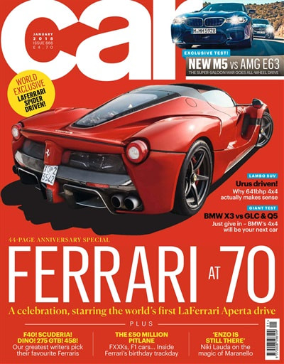
Car Magazine
This magazine was launched in 1962 as 'Small Car and Mini Owner incorporating Sporting Driver' but was changed to 'Car' in 1965. In the 1960s 'Car' pioneered the 'Car of the Year' (COTY) competition that was subsequently decided by motoring journalists on an Europe wide basis. In the 1970s and the 1980s 'Car' was far ahead of the other motoring magazines for the quality and depth of its writing, artwork and photography.
This magazine was launched in 1962 as 'Small Car and Mini Owner incorporating Sporting Driver' but was changed to 'Car' in 1965. In the 1960s 'Car' pioneered the 'Car of the Year' (COTY) competition that was subsequently decided by motoring journalists on an Europe wide basis. In the 1970s and the 1980s 'Car' was far ahead of the other motoring magazines for the quality and depth of its writing, artwork and photography.
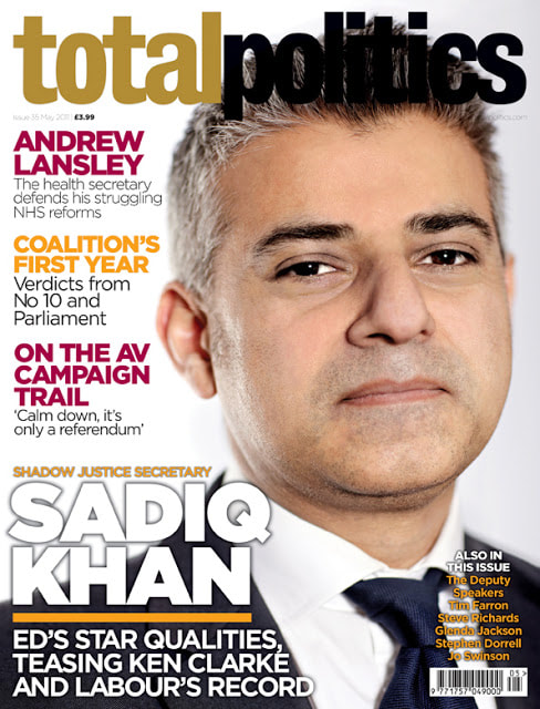
Total Politics Magazine
Total Politics is a British political magazine described as a 'lifestyle magazine for the political community'. It was first published in June 2008, and is distributed freely to all MPs, MEPs, peers, political journalists , members of the Scottish, Welsh and Northern Ireland assemblies, and all senior councillors down to district level as well as being available by subscription and sold on newsstands. The magazine was created by the conservatives journalist Iain Dale and the political commentator and author Shane Greer. The two men launched 'Total Politics' with some financial backing from the then Deputy Chairman of the Conservative Party, Lord Ashcroft, who in return owned a 25% stake in the parent company 'Biteback' Media. The magazine claims to have fundamental goal of being "unremitting positive about the political process"
Total Politics is a British political magazine described as a 'lifestyle magazine for the political community'. It was first published in June 2008, and is distributed freely to all MPs, MEPs, peers, political journalists , members of the Scottish, Welsh and Northern Ireland assemblies, and all senior councillors down to district level as well as being available by subscription and sold on newsstands. The magazine was created by the conservatives journalist Iain Dale and the political commentator and author Shane Greer. The two men launched 'Total Politics' with some financial backing from the then Deputy Chairman of the Conservative Party, Lord Ashcroft, who in return owned a 25% stake in the parent company 'Biteback' Media. The magazine claims to have fundamental goal of being "unremitting positive about the political process"
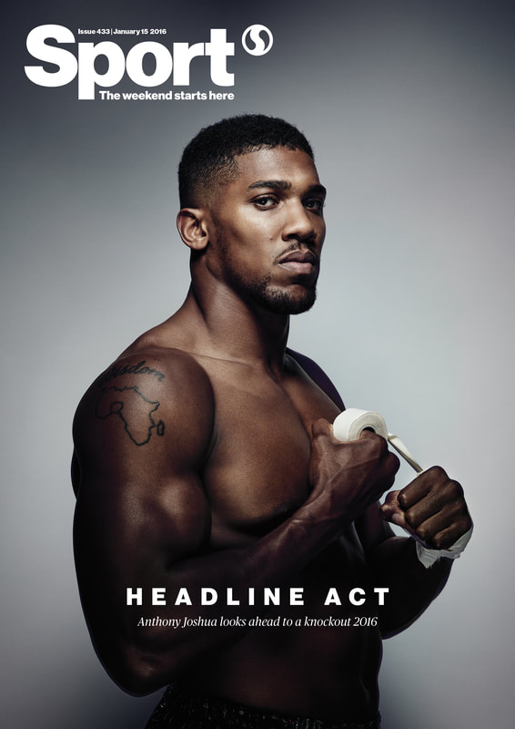
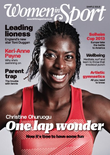
Sport Magazine
The 'Sport' magazine first started in France in 2003 as a free monthly magazine, but changed into a free weekly magazine in March 2004. The London edition started on 29 September 2006, which was the first of its type to ever hit the UK. It was sold to talkSPORT owners and UTV Media in 2009. This changed the future of sport magazines in the UK.
The 'Sport' magazine first started in France in 2003 as a free monthly magazine, but changed into a free weekly magazine in March 2004. The London edition started on 29 September 2006, which was the first of its type to ever hit the UK. It was sold to talkSPORT owners and UTV Media in 2009. This changed the future of sport magazines in the UK.
Demographics
Media producers define and categorise their audience through demographic profiles. A demographic audience profile defines groups based on things like age, gender, income, education and occupation. For example there might be a magazine for children or a leaflet for an elderly home which are for older people. Everything is targeted at everyone for a reason.
Media producers define and categorise their audience through demographic profiles. A demographic audience profile defines groups based on things like age, gender, income, education and occupation. For example there might be a magazine for children or a leaflet for an elderly home which are for older people. Everything is targeted at everyone for a reason.
Psychographics
Psychographics is the study of consumers based on their activities, interests and opinions. Psychographics focuses on understanding cognitive attributes, such as customer emotions, values and attitudes, among other psychological factors.
Psychographics is the study of consumers based on their activities, interests and opinions. Psychographics focuses on understanding cognitive attributes, such as customer emotions, values and attitudes, among other psychological factors.
Geographics
Geography of media and communication (also known as communication geography, media geography and geographics of media) is an interdisciplinary research area bringing together human geography with media studies and communication theory. Attention to how places differ regard to communication access leads to an interest in the changes that occur in places when new media diffuse into those places. A complementary interest is in how places are represented in various media. For example pictures of idyllic beaches in tourism advertisements or written description of war zones in newspapers stories.
Geography of media and communication (also known as communication geography, media geography and geographics of media) is an interdisciplinary research area bringing together human geography with media studies and communication theory. Attention to how places differ regard to communication access leads to an interest in the changes that occur in places when new media diffuse into those places. A complementary interest is in how places are represented in various media. For example pictures of idyllic beaches in tourism advertisements or written description of war zones in newspapers stories.
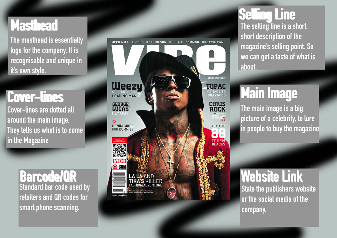
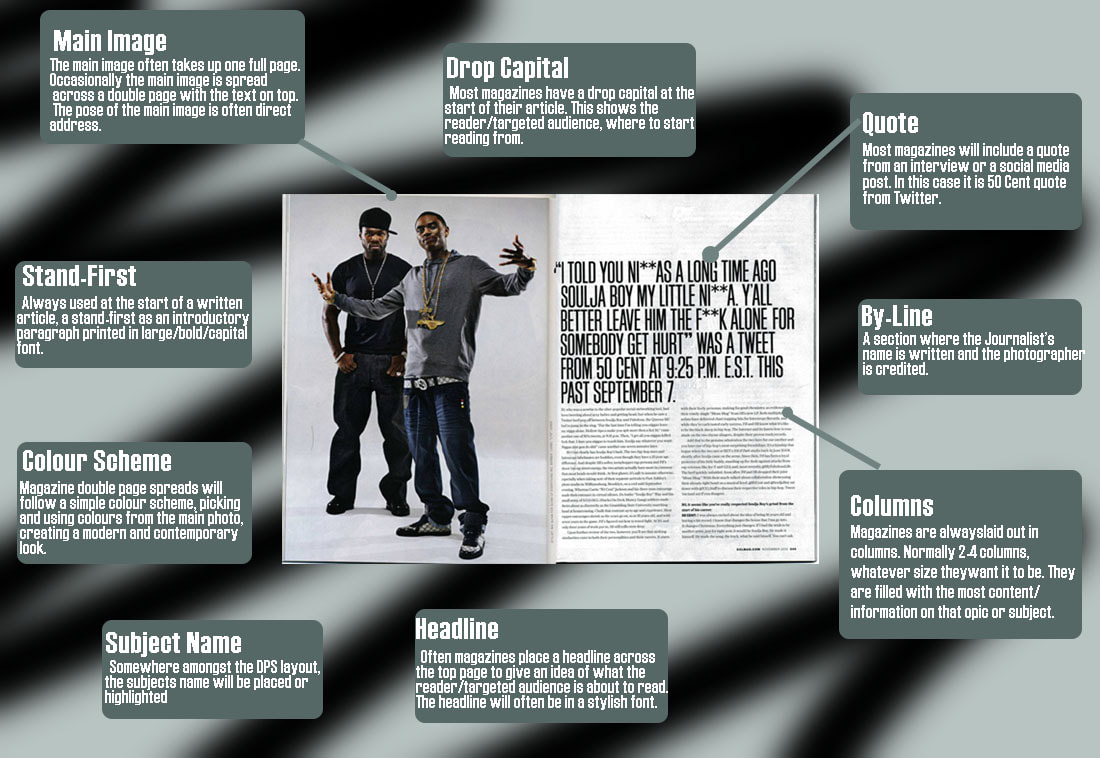
Convention Diagram
|
|
Digital Vs Print
Cost
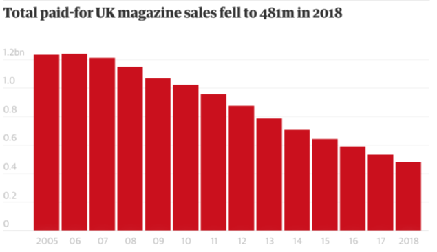
In today's society digital magazines/newspapers have become more popular than print magazines and newspapers due to its accessibility to more people from any age. People prefer digital more because as everything in society, it is digital and can be altered to fit the targeted audience's needs. For example people who have bad eyesight, could change the size of the screen to make it bigger for them to read the magazine enjoyably. Buying newspapers and magazines Digitally compared to Physically have many advantages and disadvantages. In the Guardian Newspaper they have subscription deals depending on what day you decide to subscribe on and what type of newspaper you want to buy. An example is the SixDay deal which is the all the Guardian Papers. This is £41.12 a month which is £493.44 a year which is better than paying £2.20-£3.20 everyday for a year. This bar graph shows the amount of money paid for UK magazine sales fell in 2018.
Distribution
In countries like the United States Of America, the distribution process are different depending where you live. If you live in a small town and you have subscribed for an annual newspaper, you would collect your newspaper from the local post office. But this is not always efficient. Many issues could occur such as post offices could be shut for the day or your newspaper may have gotten lost. Whereas if you subscribed digitally, it wouldn't get lost or corrupted and will always be on your account so it is accessible at anytime.
Opportunities
Not many people buys magazines and newspapers these days which means the companies who have not converted to digitally newspapers are losing money. But for the people who like to buy magazines and newspapers, they see a different perspective of things. May be they cannot use the advanced technology that many people use, or may be they like the old fashion ways of purchasing a magazine/newspaper and reading it physically in their hands. As a day goes by, technology advances even further which makes it difficult for all the new comers to be able to use the web to subscribe to their favourite magazine/newspaper company.
Limitations
There are many disadvantages in both digital and print magazines/newspapers which effect both the companies and the targeted audience. In print magazines it tends to be dull and not exciting come to read. It doesn't make you eager to come home and read the magazine. With this being said the companies are losing a significant amount of money to the people who lend materials to them in order to create millions of newspapers every year. Essentially, all the newspapers and magazines go to waste and fill our landfills. Compared to digital magazines/newspapers, the companies do not lose as much as their targeted audience. Digital magazines need to have regular updates in order to make the magazines satisfactory for the audience. But as updates come, there is always a loss for the outdated technology. Because somebody's device is not compatible with the new update, that person now has to waste money on a new device to be able to read their magazine/newspaper.
Cost
In today's society digital magazines/newspapers have become more popular than print magazines and newspapers due to its accessibility to more people from any age. People prefer digital more because as everything in society, it is digital and can be altered to fit the targeted audience's needs. For example people who have bad eyesight, could change the size of the screen to make it bigger for them to read the magazine enjoyably. Buying newspapers and magazines Digitally compared to Physically have many advantages and disadvantages. In the Guardian Newspaper they have subscription deals depending on what day you decide to subscribe on and what type of newspaper you want to buy. An example is the SixDay deal which is the all the Guardian Papers. This is £41.12 a month which is £493.44 a year which is better than paying £2.20-£3.20 everyday for a year. This bar graph shows the amount of money paid for UK magazine sales fell in 2018.
Distribution
In countries like the United States Of America, the distribution process are different depending where you live. If you live in a small town and you have subscribed for an annual newspaper, you would collect your newspaper from the local post office. But this is not always efficient. Many issues could occur such as post offices could be shut for the day or your newspaper may have gotten lost. Whereas if you subscribed digitally, it wouldn't get lost or corrupted and will always be on your account so it is accessible at anytime.
Opportunities
Not many people buys magazines and newspapers these days which means the companies who have not converted to digitally newspapers are losing money. But for the people who like to buy magazines and newspapers, they see a different perspective of things. May be they cannot use the advanced technology that many people use, or may be they like the old fashion ways of purchasing a magazine/newspaper and reading it physically in their hands. As a day goes by, technology advances even further which makes it difficult for all the new comers to be able to use the web to subscribe to their favourite magazine/newspaper company.
Limitations
There are many disadvantages in both digital and print magazines/newspapers which effect both the companies and the targeted audience. In print magazines it tends to be dull and not exciting come to read. It doesn't make you eager to come home and read the magazine. With this being said the companies are losing a significant amount of money to the people who lend materials to them in order to create millions of newspapers every year. Essentially, all the newspapers and magazines go to waste and fill our landfills. Compared to digital magazines/newspapers, the companies do not lose as much as their targeted audience. Digital magazines need to have regular updates in order to make the magazines satisfactory for the audience. But as updates come, there is always a loss for the outdated technology. Because somebody's device is not compatible with the new update, that person now has to waste money on a new device to be able to read their magazine/newspaper.
Magazine Textual Analysis
Denotation
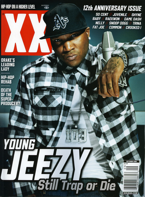
The magazine consists of Young Jeezy looking directly at the camera, with a solid look on his face. The background is a dark grey colour but as it does down the magazine, it becomes a lighter grey. The dark grey/grey colour compliments the red and white in the logo of ‘XXL’. Behind Young Jeezy’s head we can see the XXL Masthead and as well as that, we can see Young Jeezy’s name in bold capitals with other cover lines dotted around the front page of the magazine.
Mise-en-scene
In the magazine Young Jeezy has more of a gangster look, which connotes where the Hip Hop genre originated from. He has a diamond plated watch and chain as well as a diamond earring. Having these items connotes to people that he is wealthy and has a lot of money to buy diamonds. There is also a microphone he is leaning onto to emphasise that he is a professional artist. In the magazine they have a midkey lighting/ fill light was used to brighten up the subject but not to the extreme. This emphasises the dark tones and creates mystery and tension to the magazine. Young Jeezy’s nonverbal communication is serious which could connote that he is serious about his work.
Typeography
The XXL Masthead Is slightly covered by by the head of Young Jeezy. This specific magazine doesn’t have many cover-lines on the front cover of the magazine, this may connote that there is not many important news/ headlines on that specific month or week. The font is a modern font which is bold and straight edged, so it can be appealing to the target audience. The font and the white colour help the magazine to really pop out. It also aids help to people who may have difficulty reading and seeing things. All the colours compliment each other significantly which help the magazine overall to look presentable to the audience.
Target Audience
For this type of magazine/ Hip Hop genre, the targeted audience may be young people aged from 16-25. As a young person, we would all want to have jewellery that is why it stands out to us as the lowkey light shines against it, showing the beautiful textures of the diamonds in his chain and watch. This makes the targeted audience want to read the magazine for more ‘cool’ things.
Denotation
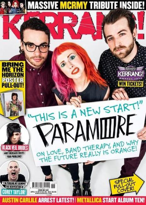
The magazine first begins with all members of the Paramore’ rock band looking directly at the camera with the person in the middle making a silly face. There is a high angle camera shot while they are holding a board with the headline on it. In the magazine it consists of many different colours which makes all the cover-lines pop out all at once. The cover-lines are very bold so it will attract their targeted audience.
Mise-en-scene
Firstly, the nonverbal communication in the magazine consists of a mixture of different facial expressions such as a silly face, serious face and a crazy face. This connotes the different moods within the magazine. The lighting is more of a highkey light as the light is strong against their faces but because of the white setting/background it is not that visible. The only prop that is used in the front cover of the magazine is the white board the rock band ‘Paramore’ is holding. Holding the white board that the main headline Is on is very unique compared to other magazines in the Rock Industry.
Typeography
The ‘KERRANG’ Masthead is slightly behind the ‘Paramore’ rock band. In the ‘KERRANG’ Masthead it has a shatter effect as if it was glass and has been broken a little bit. The cover-lines as well as the headline and masthead, all have different types of fonts. The headline has a scratch type of font as if someone got a sharp object and wrote the headline. And the cover-lines around the front page have a modern font used in many types of magazines.
Targeted audience
For this type of magazine, the targeted audience could be people from teenagers to young adults. In the front cover the girl has dyed her hair red and pink which could encourage people to do the same and copy her and what she does. The younger youth would likely to be crazy things like dying their hair.
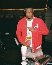
Denotation
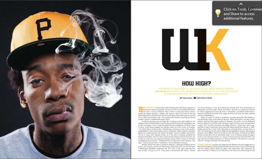
The double page has one full page of Wiz Khalifa smoking weed looking directly at the camera and the second page has information about him with a rhetorical question. The colour scheme for this magazine is clearly White, Black and a Light Orange. On the second page Wiz Khalifa’s intials are big and bold in black and orange to emphasise that the page is all about him.
Mise-en-scene
The nonverbal communication of Wiz Khalifa’s face shows that he is high but at the same time looks like he is not bothered to take the photo. The lighting used was the key light. This can be seen as we can see the whole front of his face but cannot see any lighting behind him. In the picture we can see Wiz Khalifa wear gold earrings which connotes the wealth/ the amount of money he has. There is a black background which may connote the power and respect he has in the Hip Hop Industry.
Typeography
A drop capital is used to make it easier for the reader/ targeted audience to know where to start reading from. The font is a bold, block type of font which gives a sense of seriousness to the magazine.
Targeted Audience
This magazine is for people who really admire the Hip Hop Culture and are interested in what goes on inside of all the Hip Hop music.
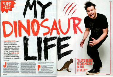
Denotation
We can see the man making a silly face, which takes up most of the page. The double page has a consistent colour way of black, red and white. On one side of the magazine there is a small T-Rex and a big T-Rex claw scratch.
Mise-En-Scene
The prop of the dinosaur is used next to the man. The NVC of the man’s face and body language tells us that he is imitating the dinosaur as it sits next to him. Mid key lighting has been used to create shadows in the background and to illuminate the face and costume of the man. The masthead says “My Dinosaur Life” which may indicate the idea how in his early life he was relevant but then became irrelevant slowly a bit like dinosaurs becoming extinct.
Typeography
The masthead of the double paged magazine has a harsh font which could connote him having many hard times in his life. A drop capital is used to tell the targeted audience where to start reading from. When the paragraph starts with a drop capital, it is much easier to follow the sentences.
Targeted Audience
In the rock genre, a broad amount of fans and occasional listeners are aged from 16-25 years old. The gender of fans is both a mix of male and female, however there are a slightly more number of male fans compared to females. The targeted audience enjoy listening to the music because it has a large impact on their lives.
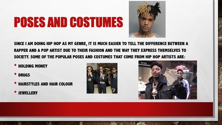
Hip Hop specific poses and costumes
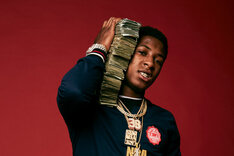
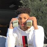
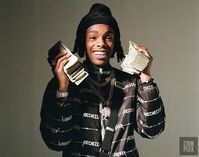
Rappers Holding Money
Rappers holding money has been a very common thing in the Rap/Hip Hop industry. Rappers hold/have stacks of money to show off their wealthiness and also to taunt their haters that they made it and that they are rich at the end of the day. In all the pictures they are all doing something similar. They are holding stacks of money to their ears. This symbolises the idea that money is calling and they have to go collect it by producing music and selling it.
|
|
|
|
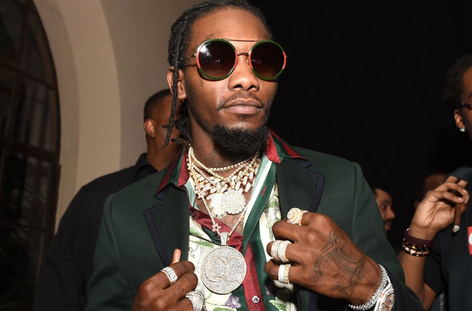
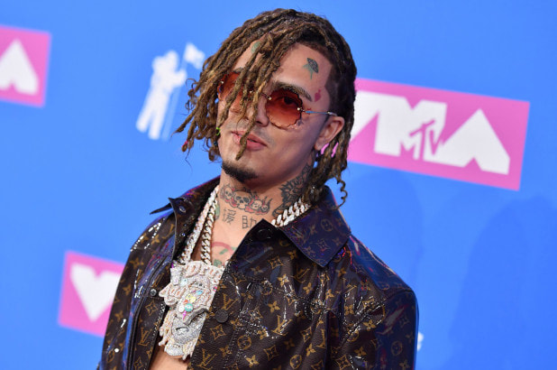
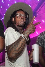
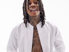
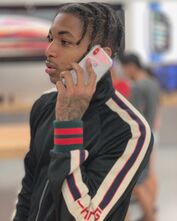
Rappers' jewellery
In the Rap/Hip Hop industry many rappers have chains, watches or jewellery, normally emphasising a bigger story of how they got it or what it symbolises. Because their jewellery is covered in diamonds it tends to show how rich they are to have lots of expensive jewellery.
In the Rap/Hip Hop industry many rappers have chains, watches or jewellery, normally emphasising a bigger story of how they got it or what it symbolises. Because their jewellery is covered in diamonds it tends to show how rich they are to have lots of expensive jewellery.
|
|
|
|
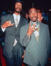
Rappers' Hand Signs
Hand signs can mean anything in the Rap industry. Normally it tends to be gang signs they are throwing up or the place they grew up in/ came from. For example 2pac came from the Westside that is why he throws up a 'W'.
Hand signs can mean anything in the Rap industry. Normally it tends to be gang signs they are throwing up or the place they grew up in/ came from. For example 2pac came from the Westside that is why he throws up a 'W'.
|
|
|
|
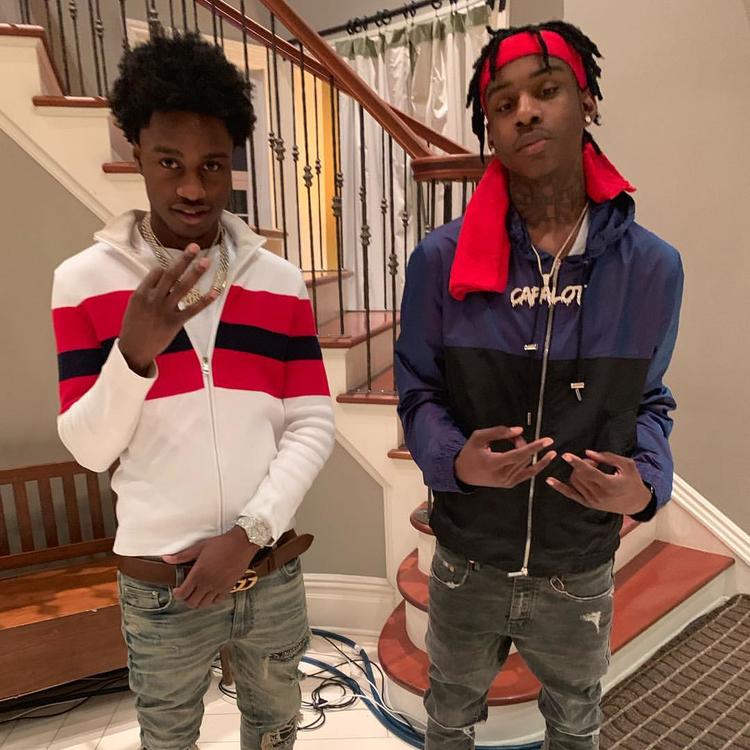
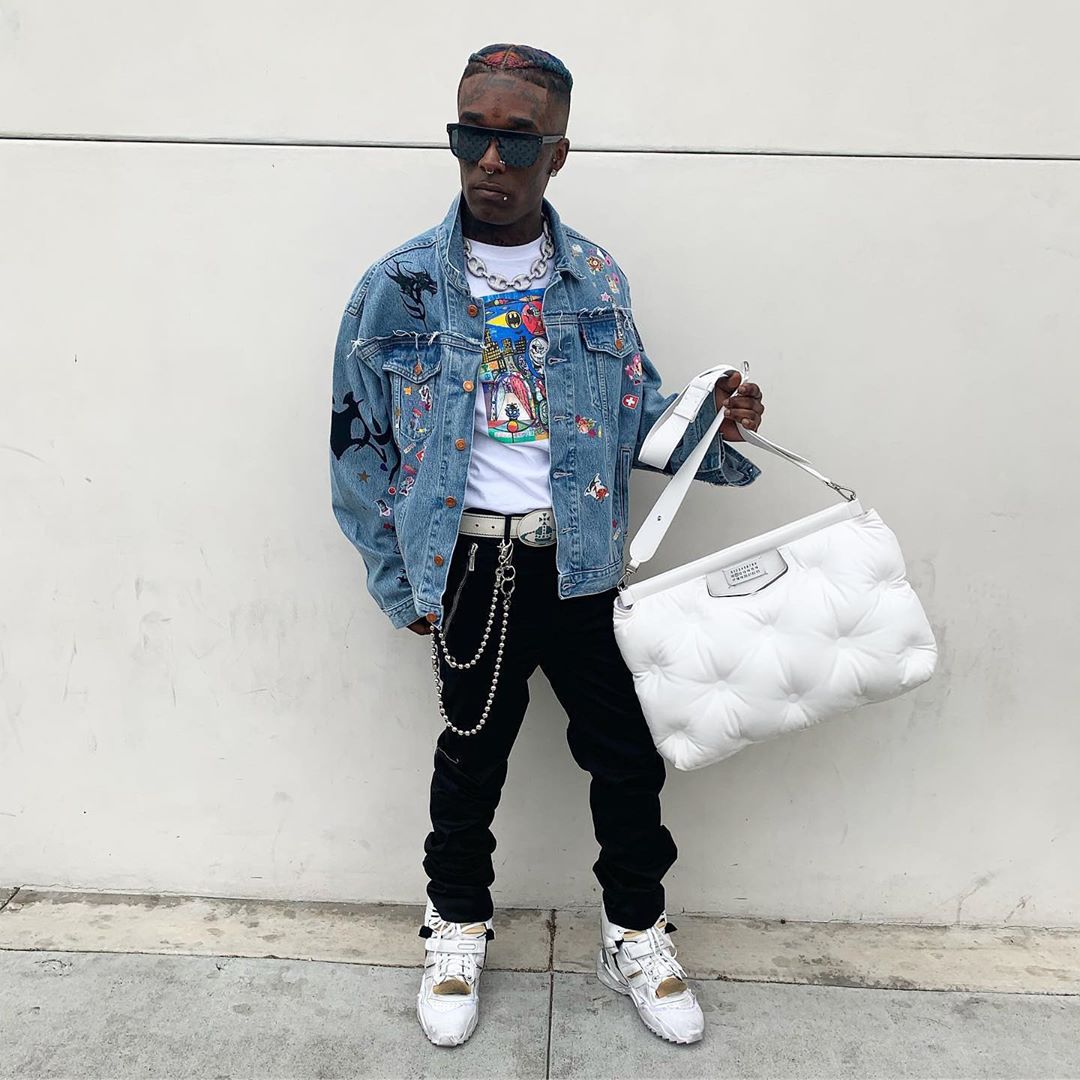
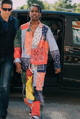
Rappers’ Clothing
In the Rap/Hip hop industry, not everybody wears the same style of clothing. Some like to dress with thought into their clothes and others dress like a casual person despite the amount of money they have.
In the Rap/Hip hop industry, not everybody wears the same style of clothing. Some like to dress with thought into their clothes and others dress like a casual person despite the amount of money they have.
|
|
|
|
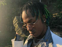
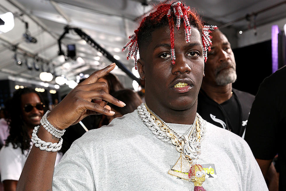
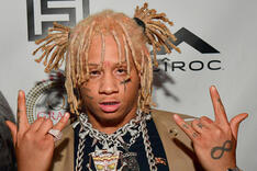
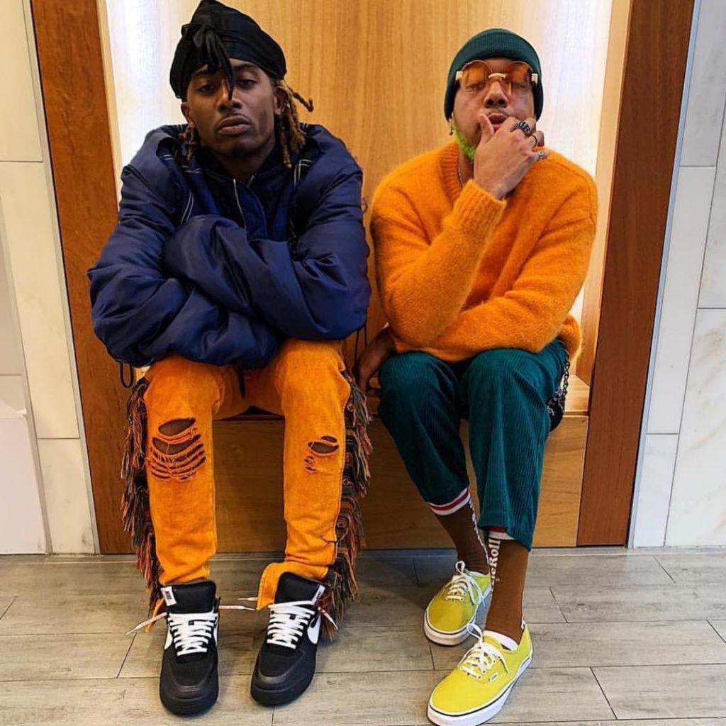
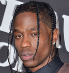
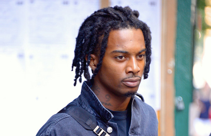
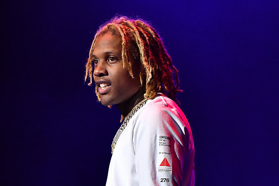
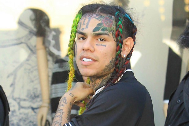
Rappers’ Hairstyles and Hair Colour
It has become common for rappers to have long hair like Dreadlocks or Box Braids. These hair styles and hair colours make rappers stand out to their fans as well as to everyone who looks at them. For example, the rapper 6ix9ine has rainbow coloured hair which nobody in the rap industry has.
It has become common for rappers to have long hair like Dreadlocks or Box Braids. These hair styles and hair colours make rappers stand out to their fans as well as to everyone who looks at them. For example, the rapper 6ix9ine has rainbow coloured hair which nobody in the rap industry has.
|
|
|
|
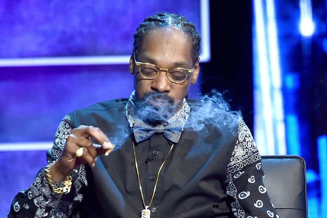
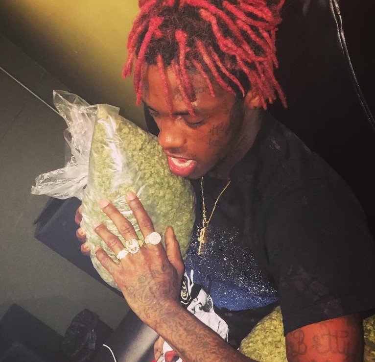
Rappers Drugs
In the hip hop industry, almost every rapper does drugs. The two popular drugs rappers do is sipping lean and smoking weed.
In the hip hop industry, almost every rapper does drugs. The two popular drugs rappers do is sipping lean and smoking weed.
|
|
|
|
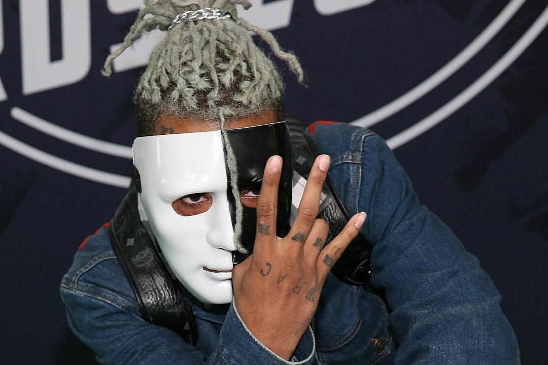
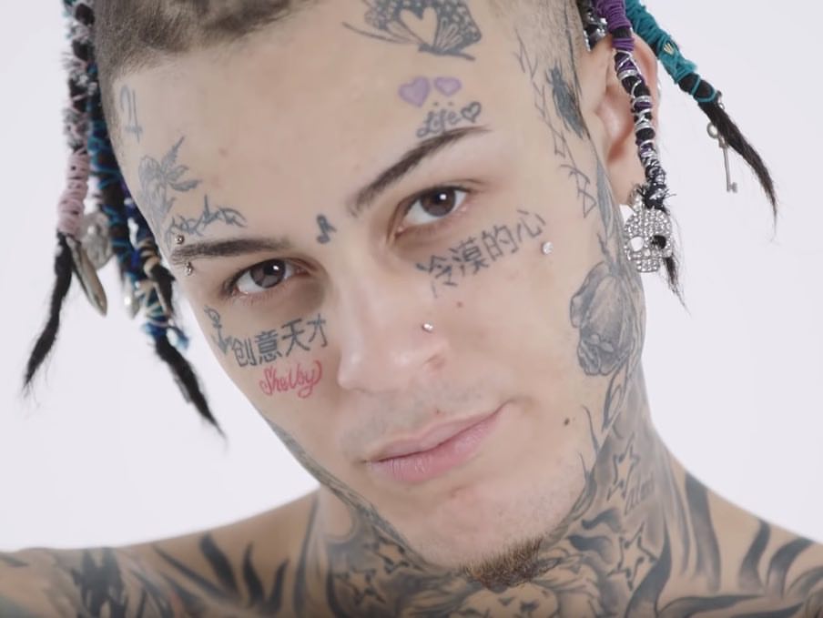
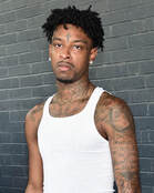
Rappers’ Tattoos
It has become normal for many rappers to have tattoos scattered around their body. Usually symbolising something that is important to them and hold close to their heart.
It has become normal for many rappers to have tattoos scattered around their body. Usually symbolising something that is important to them and hold close to their heart.
|
|
|
|
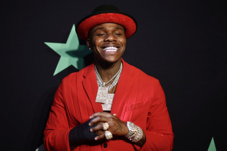
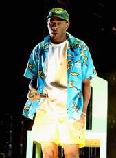
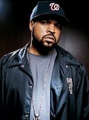
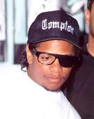
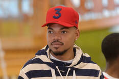
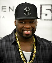
Rappers Headwear
Many rappers are on and off when it comes to wearing hats. Some wear hats all the time whereas others rarely wear hats. This has now become a fashion style in the Rap/Hip Hop Industry.
Many rappers are on and off when it comes to wearing hats. Some wear hats all the time whereas others rarely wear hats. This has now become a fashion style in the Rap/Hip Hop Industry.
|
|
|
|
Audience Profiling
General Description
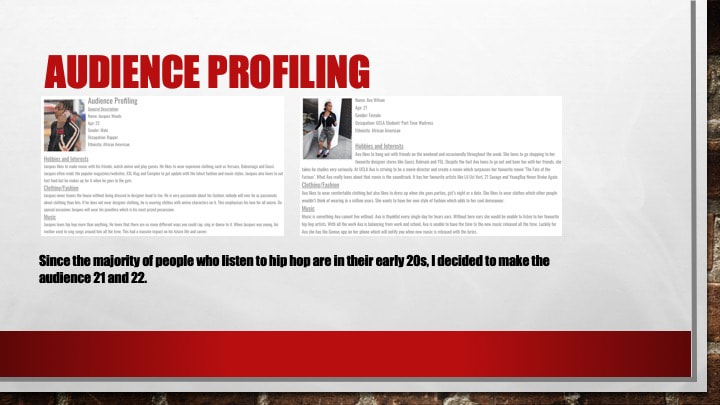
Name: Jacques Woods
Age: 22
Gender: Male
Occupation: Rapper
Ethnicity: African American
Hobbies and Interests
Jacques likes to make music with his friends, watch anime and play games. He likes to wear expensive clothing such as Versace, Balenciaga and Gucci. Jacques often reads the popular magazines/websites, XXL Mag and Complex to get update with the latest fashion and music styles. Jacques also loves to eat fast food but he makes up for it when he goes to the gym.
Clothing/Fashion
Jacques never leaves the house without being dressed in designer head to toe. He is very passionate about his fashion; nobody will ever be as passionate about clothing than him. If he does not wear designer clothing, he is wearing clothes with anime characters on it. This emphasises his love for all anime. On special occasions Jacques will wear his jewellery which is his most prized possession.
Music
Jacques loves hip hop more than anything. He loves that there are so many different ways you could rap, sing or dance to it. When Jacques was young, his mother used to sing songs around him all the time. This had a massive impact on his future life and career.
General Description
Name: Jacques Woods
Age: 22
Gender: Male
Occupation: Rapper
Ethnicity: African American
Hobbies and Interests
Jacques likes to make music with his friends, watch anime and play games. He likes to wear expensive clothing such as Versace, Balenciaga and Gucci. Jacques often reads the popular magazines/websites, XXL Mag and Complex to get update with the latest fashion and music styles. Jacques also loves to eat fast food but he makes up for it when he goes to the gym.
Clothing/Fashion
Jacques never leaves the house without being dressed in designer head to toe. He is very passionate about his fashion; nobody will ever be as passionate about clothing than him. If he does not wear designer clothing, he is wearing clothes with anime characters on it. This emphasises his love for all anime. On special occasions Jacques will wear his jewellery which is his most prized possession.
Music
Jacques loves hip hop more than anything. He loves that there are so many different ways you could rap, sing or dance to it. When Jacques was young, his mother used to sing songs around him all the time. This had a massive impact on his future life and career.
Name: Ava Wilson
Age: 21
Gender: Female
Occupation: UCLA Student/ Part Time Waitress
Ethnicity: African American
Hobbies and Interests
Ava likes to hang out with friends on the weekend and occasionally throughout the week. She loves to go shopping to her favourite designer stores like Gucci, Balmain and YSL. Despite the fact Ava loves to go out and have fun with her friends, she takes he studies very seriously. At UCLA Ava is striving to be a movie director and create a movie which surpasses her favourite movie ‘The Fate of the Furious’. What Ava really loves about that movie is the soundtrack. It has her favourite artists like Lil Uzi Vert, Roddy Ricch and YoungBoy Never Broke Again.
Clothing/Fashion
Ava likes to wear comfortable clothing but also likes to dress up when she goes parties or a date. She likes to wear clothes which other people wouldn’t think of wearing. She wants to have her own style of fashion which adds to her cool demeanour.
Music
Music is something Ava cannot live without. Ava is thankful every single day for hears ears. Without here ears she would be unable to listen to her favourite hip hop artists. With all the work Ava is balancing from work and school, Ava is unable to have the time to the new music released all the time. Luckily for Ava she has the Genius app on her phone which will notify you when new music is released with the lyrics.
Magazine Production
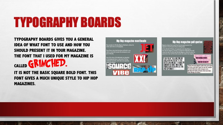
This is my first attempt of my magazine template. I have named my Masthead and used the font "Grinched" to cancel the stereotype that all Hip Hop Magazines have the same Big and Bold font.
The next time i go on my magazine i want to be able to add my subject model to i can change the background according to how it looks.
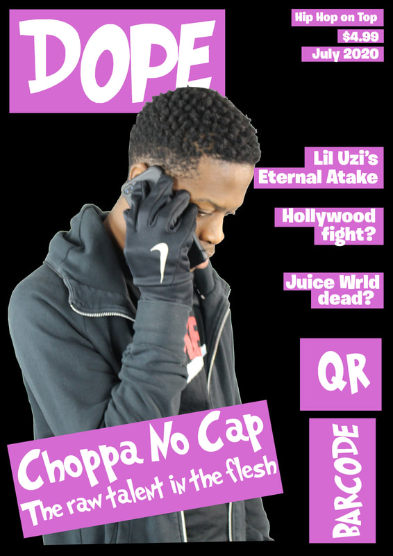
Today i added my subject to my magazine, which brings me one step further to my final product. I made my selling line and the date smaller and pushed into the corner so that it is not the main attraction for the targeted audience. I want the targeted audience to have their eyes on the main coverline which has the rappers name on it.
This week I decided to add the QR code, Barcode and the coverlines to my magazine. I have also added dividers under each of the rapper's names, so it is clear to see and read for the targeted audience. I had to change the colour countless of times because it didn't compliment the grey texture of the background. The guidelines are really helpful while making my magazine as it gives me the idea of how the magazine would look when it is finished. I have also used a different font for the coverlines to have some of the stereotypes linked with Rap magazines.
While editing my magazine, i decided to change my font "Grinched" to the font "Long Shot" because it didn't make sense for all the coverlines to be in one font and the masthead to be in another. I also did more research about how the Main Coverline is designed in Hip Hop Magazines. I saw that they didn't have a shape behind their text, but they had a filler behind the text. This diverts the targeted audience's attention from the Masthead to the Main Coverline.
|
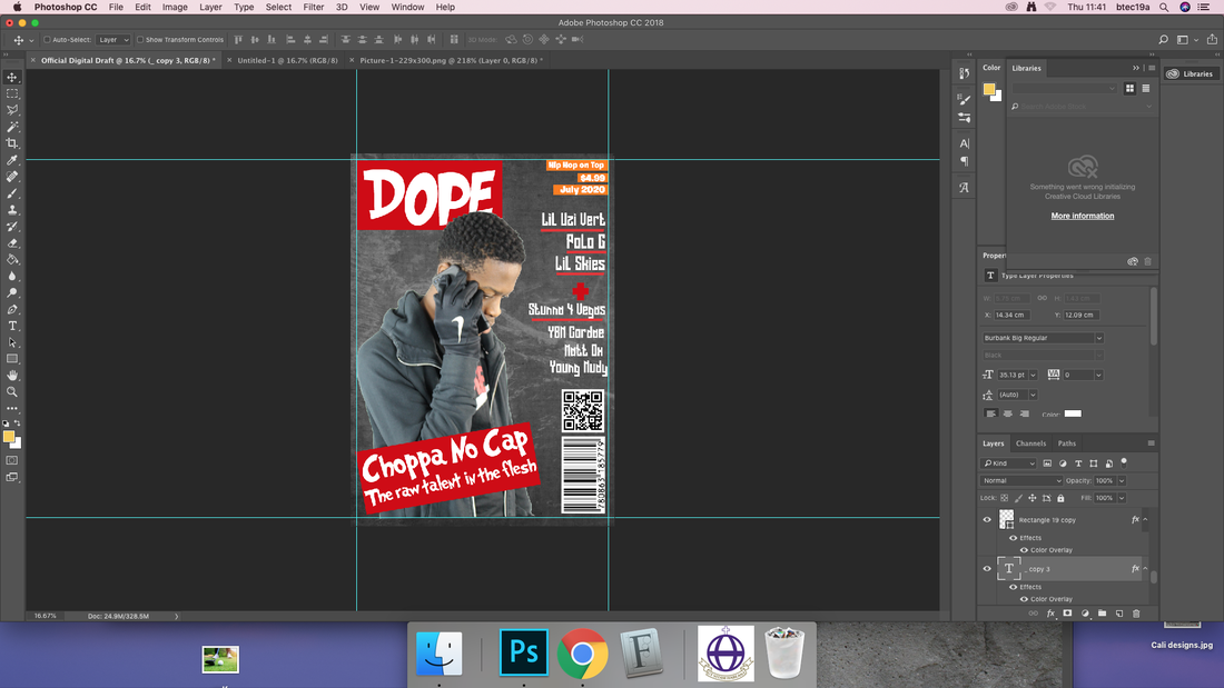
Today while designing my magazine, I didn't like the way my social media icons looked at the bottom of my magazine. So I decided to create three equal circles for the social media icons to be put in. I made the QR code and Barcode smaller so that the icons could fit on top comfortably. This was a very important move as it makes my magazine look more like a professional magazine like XXL, The Source etc.
|
|
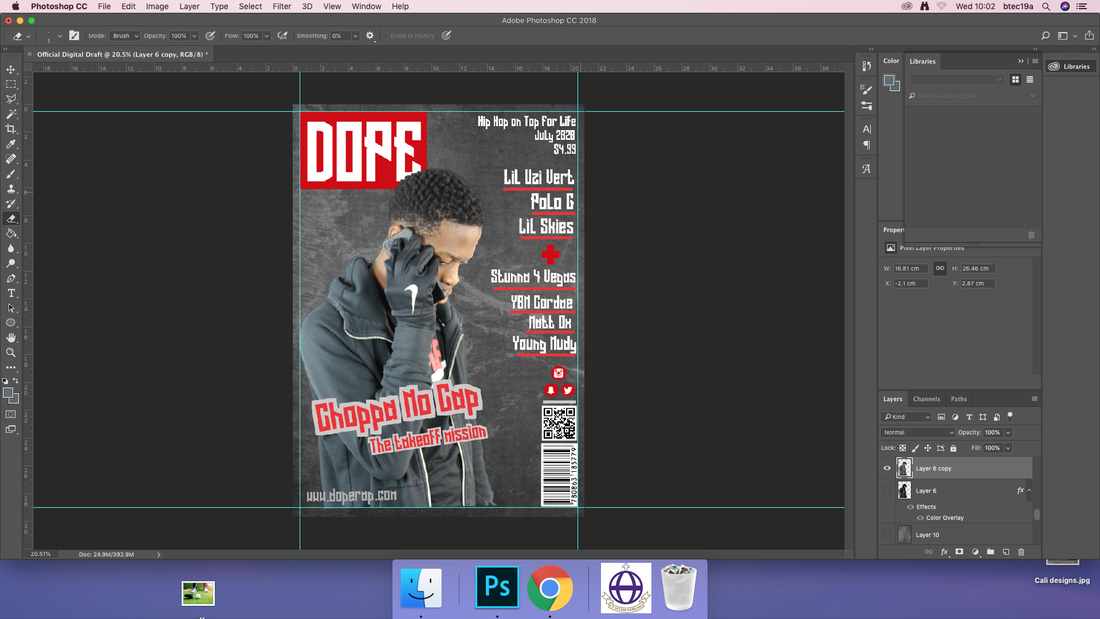
In today's lesson i have made some minor changes to my magazine. If you look in my pervious log, you can see that there was a white outline going around my subject, which wasn't good for the overall look of the magazine. So I used the Eyedropper Tool to get a similar colour from the hoodie and from my subject's face and hair. This now compliments the background as well as the Masthead, Main Coverlines and other Coverlines. It looks much more presentable and to be called a professional magazine.
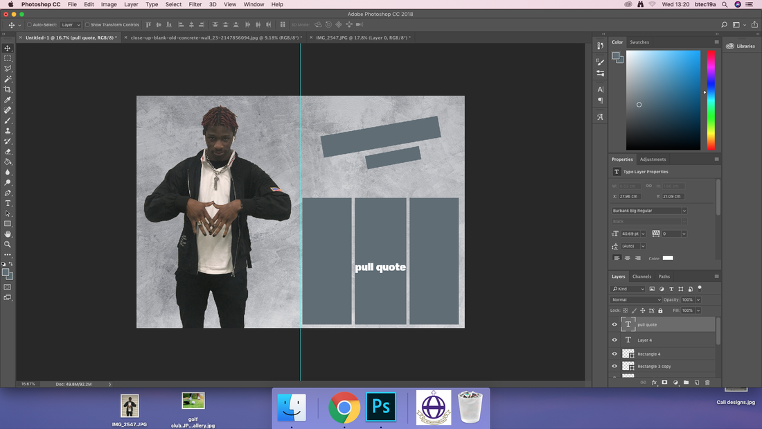
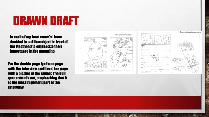
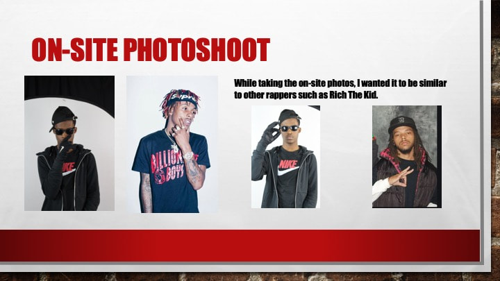
Today I started my Magazine Double Page Spread. It took me a while to get my Off-Site photo and to crop out the background perfectly. This had to be done correctly in order for my Double Page Spread to look as professional as i would like it to be. I also added where and how my Double Page will be laid out. I put three columns to indicate that the writing would be there. In the middle column i put a pull quote. I did this because i wanted the overall writing to be based around the pull quote (the writing as well as everything else links back to the pull quote in the middle of the page). I kept a similar texture effect to show the rough times the rappers have been throughout their young childhoods.
|
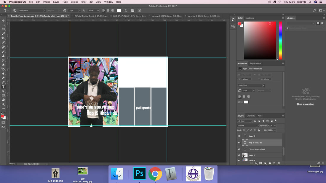
In today's lesson, I found getting a good background difficult due to the contrast of my photo. I want to make my picture of my subject to compliment the graffiti background with it. If i cannot change the colour of my picture, i will have to find a different background that suits the picture perfectly. I also researched other Hip Hop Double pages and see what they all have in common. They all used strong bold fonts to make the Pull Quote stand out to the targeted audience. Next lesson I will begin to write my interview and see if the chosen fonts are suitable for my Hip Hop Double Page.
|
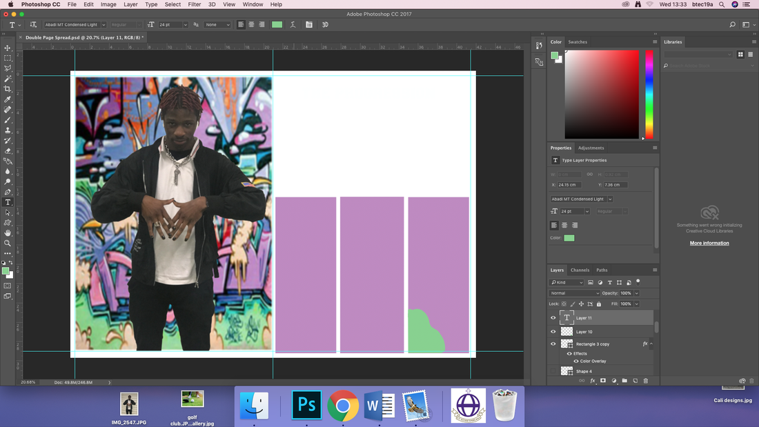
Today I was editing my script which will be put into my Double Page Spread next lesson. In the Double Page Spread I decided to change the colour of the grey boxes to pink/purple boxes to have a correlation to the graffiti background behind my subject. I did this because the grey colour only fit the Magazine Front Cover which had a Grey Textured Background and a Red and Grey colour scheme. It wouldn't make sense to make the Double Page the same otherwise the targeted audience may lose interest because of the same boring colour scheme throughout the magazine. I also decided to create a green 'smudge' mark so that the targeted audience strongly understands the correlation between the graffiti background and the boxes of text.
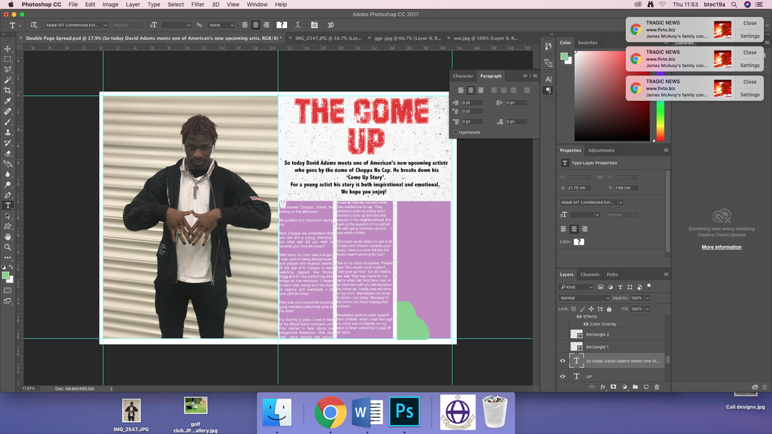
In Today's lesson I did some more research on Hip Hop Double Page Spread. I came across a Rick Ross magazine and a Meek Mill and Soulja Boy Magazine. They both had one thing in common and that was the white textured background. I then decided to add a white textured background and remove the graffiti background to make my Double Page Spread look more like a Hip Hop Magazine. I also added the Stand First and the Interview into the magazine. Next lesson I am going to add my Pull Quote into the middle of the Interview to emphasise that the Interview revolves around the Pull Quote "Rap is what I do". For the title "The Come Up", I made the font 'Campus' so that it had a texture on it like the white background.
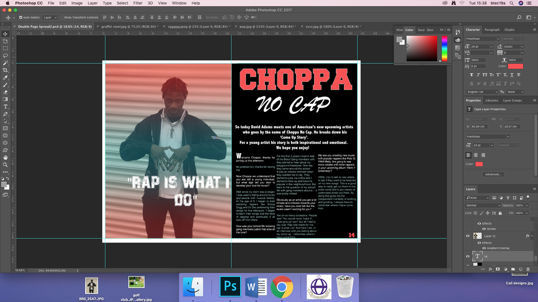
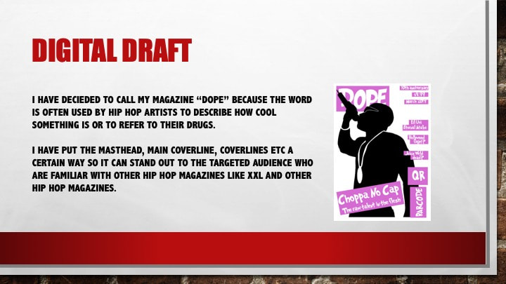
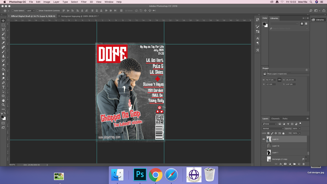
In today's lesson I made some drastic changes which changed my overall look of my Double Page Spread. Firstly I added a Juxtaposition technique to my artist's name. The word 'Choppa' is in a bold block font but it is much different compared to the 'no cap', which is in a fancy complex font. Having this Juxtaposition gives two different sides to the rapper. On one side he is normal rapper he is, but on the other side he is a fancy and popular artist on special occasions. I also added a gradient colour to my image which changed it from looking dull to more lively and corresponding to the set colours. I also used a worn out block font to emphasise his rough background.
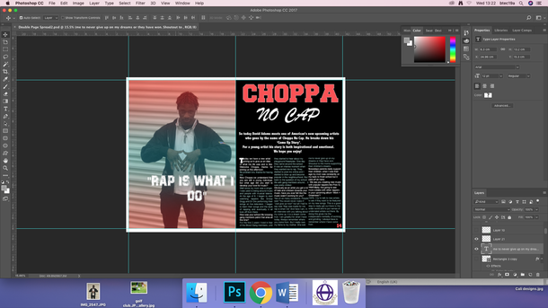
In the final lesson I made a few minor changes like changing my Drop Capital to look even more professional. I also changed my columns to all fit in the magazine as the same size. By doing this it emphasises that the interview carries onto the next page. It will draw to reader to move to the next page when reading the interview. The targeted audience will see other stories in the magazines and would want to read them so it looks appealing to them. Having the gradient on my image doesn't only correspond to the text colours but it also is easy and soft to look at if some of the targeted audience have impaired eyesight. The Eyedropper tool made collecting colours much easier than I thought.
While creating my Hip Hop Magazine, I constantly had to research my genre in order to learn and pick up new ideas that I could add to my magazine. While researching rappers poses and costumes, I realised they all had a strong connection in how they present themselves to their fans and the public. Often rappers will have long coloured hair, wear jewellery, do hand signs when taking a photo and wear expensive clothes. I decided to include all of this in my magazine to continue the fashion style of Hip Hop. As a fan of Hip Hop, the targeted audience tends vary from people aged 15-30. In my Double Page Image, I decided that my subject would be wearing the famous fashion styles of coloured long hair, jewellery and hand signs. My subject has red twists, a silver chain around his neck and is doing a triangle hand sign with his hand which emphasises the continuity of Hip Hop Culture. By doing this, the targeted audience will see what type of rapper my subject is and develop their own opinions due to the way he presents himself. I made my subject stand in front of a steel shutter to emphasise the juxtaposition that has been used. My subject is a wealthy looking person and the steel shutter contradicts when he is standing in front of it. But in the Front Cover my subject has a grey rough background to show the targeted audience what a harsh and rough life the rapper had in the past. This gives the targeted audience the urge to open the magazine to read about his life as a child.
The Typography was a difficult part of my magazine to work on. I researched many Hip Hop Magazines and how their Mastheads, Coverlines and Main Coverlines was manifested to look appealing to the audience. The Masthead and Main Coverline was a simple strong bold font which seem to always catch the eye of the person reading it but coverlines was difficult as it is only small detail but cannot be unattractive to the audience. I found a bold font that wasn’t striking to the audience. On the coverlines I made the decision to put some famous artists like Lil Uzi Vert, Polo G, YBN Cordae because they will be eye catching for the targeted audience.
The Typography was a difficult part of my magazine to work on. I researched many Hip Hop Magazines and how their Mastheads, Coverlines and Main Coverlines was manifested to look appealing to the audience. The Masthead and Main Coverline was a simple strong bold font which seem to always catch the eye of the person reading it but coverlines was difficult as it is only small detail but cannot be unattractive to the audience. I found a bold font that wasn’t striking to the audience. On the coverlines I made the decision to put some famous artists like Lil Uzi Vert, Polo G, YBN Cordae because they will be eye catching for the targeted audience.
